iWeb Dedicated Hosting
Brief
Stakeholder
Director, E-Commerce Marketing
Needs
- Improve conversion rates and lead generation;
- Improve Google Quality Score by clearly displaying key actions at the top of the page;
- Create a template for other product or service pages (header).
Constraints
- Keep the actual table of offers as is;
- Time (about 2 months).
Core Team
- Director, UX
- Content Strategist
- Lead Visual Designer — that’s me!
- UI Developer
My Role
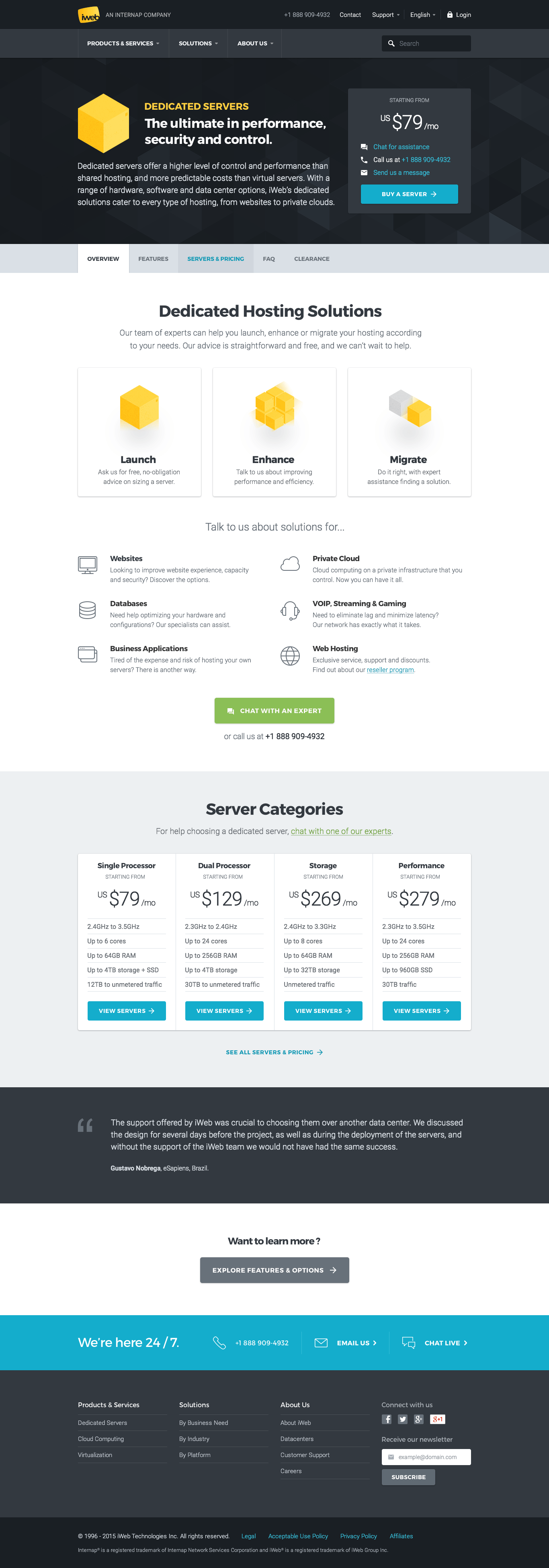
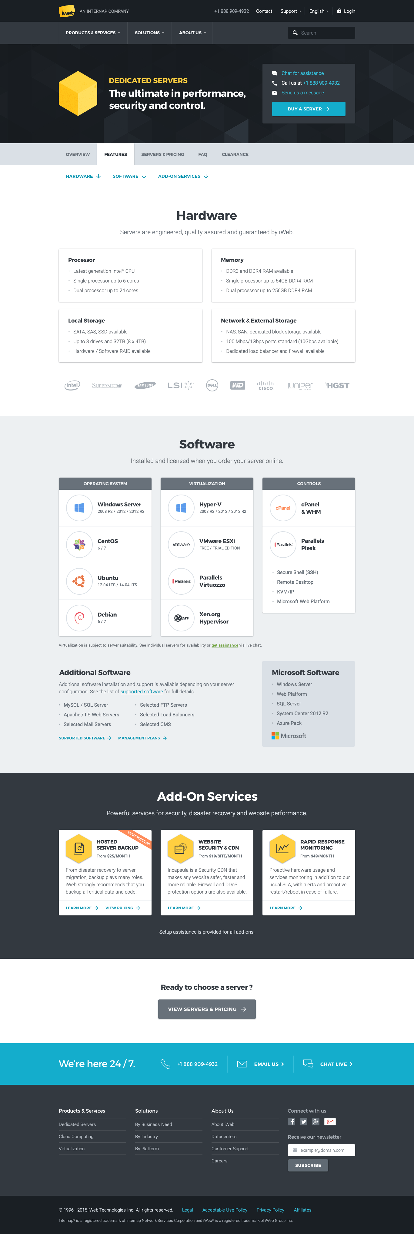
When I started working on the project, a “content platform” had already been created by the Content Strategist. The director of our team (UX) and I designed the wireframes in a brainstorming session. I basically did the job of a UX/UI Designer.
My Taks
- UI & Graphic Design
- Interaction Design
- Internal Presentation
- WordPress Integration (Visual Composer)
Shared Taks
- Wireframes
- Content Strategy
Deliverables
Wireframes
The wireframes were designed by considering the three personas that were previously described. Most of the wireframes and information architecture were sketched during a brainstorming session, but some of the sections of the pages were later refined by me.
Here are a few photos of my sketches:

UI & Graphic Design
While designing the new pages, I also updated the global style of the website to a more minimalist and coherent look. Later on, I also updated the style guide and created a simple documentation for internal use (colors, typography, icons, etc.) on these changes to make sure all future UI design are consistent.
Results
Internally, all stakeholders were quite satisfied with the end result because the information presented on the page was more accurate and followed a logic flow.
Finally, I wanted to see if the new section had significant effects on our key performance indicators, but considering the fact that we were facing other issues that affected the website (e.g., 50% drop in visits compared to last year’s period) and because the search engine marketing strategy changed (smaller budget and more Unbounce landing pages), the numbers were mostly irrelevant to my analysis.
Although, by analysing statistics from Google Analytics and the heatmaps generated by Visual Website Optimizer, I noticed that the visitors seemed to follow the main and alternative flows that we designed. By doing this, we could assume that they were better informed at the end of their session on the website. Optimizing the flow of information for each persona also seemed to have a positive effect on the exit percentage; It dropped by 19.14% compared to the previous year’s period.
 A portion of the heatmap of the Overview page (Visual Website Optimizer)